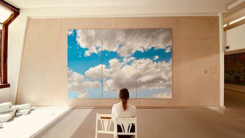
Pantone has just unveiled its latest trendsetting colors, and the buzz is all about 'Cloud Dancer', the chosen 2026 Color of the Year. This unique shade of white is not just any white—it symbolizes simplicity and offers a blank canvas that many believe will usher in a sense of calm in our chaotic world. It's like a fresh start on a rainy day, where you can see the clear sky behind every cloud.
The decision to spotlight 'Cloud Dancer' reflects our collective yearning for neutrality amidst global complexities. From art to interior design, from fashion trends to creative design, many are already predicting its influence across various industries. The announcement has sparked lively discussions among designers and enthusiasts alike, revealing mixed reactions while underscoring the unyielding power of color psychology in our lives.
Breaking Down Cloud Dancer
This section opens up the world of 'Cloud Dancer' and its significance in today's design trends. Pantone's focus on a minimalist vibe reveals much more than surface-level simplicity. The color stands out as a promise of soothing calm, wrapped in mystery and endless potential.
Many have found that the subtle nuances of this shade of white can evoke a more profound emotional response than one might expect. Designers see it as a versatile base, a canvas that allows other colors to play and pop around it without overwhelming the overall balance. Consider interior design where walls of 'Cloud Dancer' provide an excellent backdrop for bolder elements—this is a trendsetting move that is already inspiring creative design.
The appeal lies in its delicate simplicity. It's not just a blank slate; it quietly shouts confidence and clarity. When you think about it, the color embodies a quiet sophistication, much like the soft glow of dawn. And isn't there beauty in knowing that sometimes, less can indeed be more?
The Impact on Various Industries
Let's dive into how 'Cloud Dancer' is poised to influence several creative sectors. From fashion trends to interior design, Pantone's announcement has stirred up excitement among professionals as well as enthusiasts on social media.
The fashion industry, always on the hunt for fresh color inspiration, is already exploring new ways to incorporate 'Cloud Dancer' into their seasonal collections. Designers are drawn to its versatility—it pairs well with almost anything, allowing for innovative combinations and trendsetting outfits. Whether on runways or in everyday streetwear, this adaptive hue is giving rise to a palette that many believe will redefine modern elegance.
Interior design is another arena where 'Cloud Dancer' makes a bold statement. Imagine a living room painted in this gentle white, offering a subtle backdrop that enhances natural light. It’s like opening a window to a peaceful, airy space that makes even the smallest room feel expansive. This approach is in tune with current design trends that prioritize clean, well-organized spaces and a minimalist aesthetic, allowing the architecture itself to shine.
Real estate experts are also keen on this trend, noting how homes painted with uplifting, neutral tones can create a welcoming environment for potential buyers. In a world that often feels overwhelming, these calming spaces help people reconnect with their inner peace.
Understanding the Symbolism and Psychology
When we delve into color psychology, it's fascinating how 'Cloud Dancer' manages to evoke such strong emotional responses. This section examines the deeper meaning behind the color and why many believe it is much more than just a trendy choice.
White has long been associated with purity, new beginnings, and a sense of calm. Pantone's selection of 'Cloud Dancer' takes this a step further. It is a nod to those seeking a reprieve from the complexities of modern life—a clean slate in a cluttered world. For many, this color embodies a promise of balance and stability at a time when our environments are often saturated with distractions.
Interestingly, 'Cloud Dancer' also acts as a metaphor for hope. Like a soft beam of light breaking through clouds, it reminds us that clarity and focus are always within reach. In design and artistic expressions, this concept resonated, which is why many creative professionals are turning their attention to this neutral yet powerful shade.
The impact on color forecasting is equally significant. As industry experts at the Pantone Institute have hinted, the choice of this shade will likely set the tone for design trends over the next few years. Color inspiration for future projects is intimately tied to the psychological and emotional undertones that 'Cloud Dancer' presents. It’s a modern classic waiting to redefine the language of color.
Mixed Reactions and Future Projections
Not all feedback has been unanimously positive, which adds to the intrigue behind this color selection. In this section, we explore the various viewpoints regarding Pantone's bold move, and what the future may hold.
Public reaction has been a blend of enthusiasm and skepticism. While many celebrate the calming, neutral aesthetic that 'Cloud Dancer' offers, some critics feel that a shade so subtle might lack the excitement required to make a dramatic cultural impact. These controversies are a testament to how powerful and polarizing color trends can be when applied to diverse fields such as interior design, fashion trends, and creative design.
One could argue that this very debate is what makes color forecasting so enthralling. Every shade carries stories, emotions, and interpretations, reflecting our multifaceted society. As we see it, 'Cloud Dancer' bridges the gap between even the most vibrant hues and the understated elegance of minimalism, appealing to both the avant-garde and traditional sensibilities.
This evolving discourse reminds us of the unpredictable nature of trendsetting colors. Just as our lifestyles shift and adapt, so too does our approach to design trends. Pantone's 2026 Color of the Year is not just a fleeting moment in the fashion calendar—it symbolizes a long-term shift in our cultural narrative, gradually influencing how we perceive and interact with the spaces around us.
Embracing a Calmer Future
This final segment wraps up our exploration of 'Cloud Dancer' by looking forward. It offers a reflection on how this serene hue might transform not just spaces, but the way we see ourselves and our environment.
As we move through an era marked by rapid changes, there is a distinct allure in coming back to simplicity. 'Cloud Dancer' encapsulates that essence perfectly. Its neutrality encourages us to pause, reflect, and reimagine our surroundings with a focus on balance and clarity. The choice by Pantone is a bold statement that amid the chaos of modern life, there is still a place for calm and purity.
In conclusion, Pantone's announcement of 'Cloud Dancer' as the 2026 Color of the Year signals an exciting transition toward embracing minimalism and calm. Whether you're an avid follower of color forecasting, a designer eager to experiment with interior design, or simply someone looking to bring a bit more tranquility into your daily life, this shade stands as a vibrant beacon of hope. Its subtle charm and versatile application might just be what we need to infuse our lives with a touch of serene brilliance!


